Monday, March 28, 2011

Stamps: 1892-1912 French Colonies "Navigation & Commerce"

It only took 2 visits to the Coryell's Ferry Stamp Club for them to ask me to give a presentation at an upcoming meeting. I wasn't sure what topic to discuss, so I tossed out a few ideas: Space? Too broad. Imperial Chinese coiling dragons? Certainly interesting, but a bit obscure. World-wide air mails? Nah, I'm still just kinda dorking around with those and haven't settled into a strategy yet.

Well, I had just begun collecting the 1892-1912 French Colonies "Navigation & Commerce" omnibus issue. I have a few and am definitely planning to get more...plus it's a topic I was researching anyway...so I blurted it out, and it stuck. Not 30 seconds later was I reflecting to myself "Dude, what have you just gotten yourself into?"

Hey this kid loves a challenge, right? So let's get to it:

OK, in the years prior to 1892 France was issuing postage stamps for use in her colonies abroad. They were not specific to the colony and are therefore referred to as "general issue" stamps. They looked something like this:


Notice, this stamp does not indicate what colony in which it should be used. Some smart cookies realized you could make a tidy profit by using these stamps to exploit variations in the rate of exchange in different colonies. Can't have that, can we?

So in 1892, just as the proverbial &*%$ was hitting the fan over the whole panama canal bankruptcy/bribery/corruption fiasco, important French people, taking a few moments to breathe between Jew hating sessions, issued the very first "territory-specific" omnibus stamps for it's colonies. These stamps featured allegorical representations of "Navigation" and "Commerce" and looked like this:


Notice, it was easy enough to print lots of these and then add the name of the specific slave farm colony in the little box at the bottom, thus ending any potential confusion regarding the location of the post office in which you were...situated.

The idea went off like gangbusters and so, from 1892 to 1912, 28 French Colonies produced 491 different varieties of these babies, ranging from the humble 1 centime denomination to a full 5 francs! A significant source of this variation arose from the practice of overprinting surcharges on existing issues. Here's an example:


The stamp on the left is the original, while the one on the right bears a surcharge effectively changing the stamps value from "15" to "05". This was done in order to re-use surplus stamps and avoid unnecessary waste. It's the kind of thing you don't see much any more because we are now more forward-thinking, environmentally conscious people, and recycling is more important than ever if we want to save our pla ~ errr, ok, not a good example, moving on...

These stamps were so popular that intelligent and creative people decided to make their own! Yes, forgery is extremely common among these stamps, most notably those of a rather famous forger, Francois Fournier, and his little buddy Charles Hirshburger. These two were apparently so prolific that a random search through an average collection of "navigation and commerce" issues will likely turn up some well documented forgeries. But, how can you tell the real deal from a forgery?

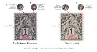
Check this out:


There are three easy steps to identify a Fournier forgery among the navigation and commerce issues.

1) Checking perforations with a gauge - authentic "navcom" stamps are 14 x 13.5, while the forgeries are typically 13.5 x 14.

2) Checking Navigation's staff hand - it should have crisp discernable fingers, not just a blob with thin lines.

3) Checking the fruit in Commerce's cornucopia - it should appear as a distinct round shape set apart from the rim of the cornucopia. The rim of the cornucopia under the fruit is often either continuous or close to it on authentic stamps. On forgeries, the fruit shape is more oval in appearance and the rim is clearly compromised.

These details are plainly obvious under light at 10x magnification.

-- There's much more to learn about these stamps and I'm working on it...again there are 28 colonies and 491 unique issues...here's a quick peek at the spreadsheet I'm building to track my collection as I move forward:


And what you see there is really just the tip of the iceberg...when it's ready this "checklist" will go on for several pages in landscape format. Wish me luck and if you have interest in learning more about or collecting these let me know.

Friday, March 25, 2011

Rockin' the Tai Chi Website

Some may know I have recently been doing some web development for my affinity associations. It started with the bonsai club, and that went so well other people have been asking me to see what I could do for them. Well, the folks at the T'ai Chi classes asked me to help out and so I've begun workin' it out for them. When I'm done with this one I'll get cracking on the stamp club web page...

OK, here's the old tai chi index page...note the cheesy bamboo wall paper, unceremoniously pasted, super-size logo and clunky scrolling marquee. Blech! With all due respect, kudos to the group for having a page at all, but seriously, they needed help. Alec to the rescue!


To see it in action visit Old Tai Chi Page

Now I took my time, simplified the layout and added a bit of style to the page. The same info is all still there, so that will all need to be updated and formatted, etc., but it's a bit more inviting and a lot easier on the eyes...


Check it out...the yin-yang in the logo spins...such a simple detail changes the entire impact of the logo. Bam! Now that's something! see it in action here

Again, there's a lot more work to do improving the site overall. At the end of the day it's about blending content and style with intuitive navigation for ease of use. This happens over a period of time, with 100 tiny edits and adjustments once you have the basics down.

Tuesday, March 22, 2011

2011 Pinewood Derby


Frankie and I destroyed all competition at the Pinewood Derby....again. So, it's off to the district races in 2 weeks. Special thanks to Sir Isaac Newton, Lord Baden Powell (founder of Boy Scouts) and of course, Don Murphy (founder of the Pinewood Derby). Who knew a simple chunk of wood could be so exciting!?!

I have to tell you - I don't do much "trash talking" in my various exploits...you can't cross your arms with a cheeky grin and quietly state with unwavering confidence "you're going down, sucker!" at, for instance, a bonsai exhibition or a stamp club meeting. You certainly can't do it most anywhere while wearing an adult size cub scout uniform with the special navy blue epaulets and official BSA olive drab socks. Trust me, it's in direct opposition to the laws of nature.

But, once a year in early Spring, I reserve the absolute right to "throw down" with the best of them at the annual Cub Scouts Pinewood Derby. Of course it's all done tongue in cheek and in good fun among people with whom you'd be perfectly comfortable teaching your children how to play with knives, literally.

OK so...let's get to the juicy. Last year's car was a streamlined black beauty and took 2nd place at the district races. I hand carved it with a chisel before realizing the 5oz weight limit was absolutely necessary to attain if you wanted any chance of actually competing. My solution was to carve out the rear cowling (the hump behind the driver) and all fenders and fill them with lead shot. From there, I learned all I could about axle prep and lubrication and did my best. Frankie's involvement was limited to choosing black as the color and sticking the "Number 7" on the hood.


While it may not look like much from this pic, the car has a tangible intimidation factor on the starting line. The paint is actually quite nice and glossy black, showing off the refined curves and balanced proportions. It looks fast, and makes most cars placed next to it appear as glorified doorstops.  

Well, we blew them all away. All but one... and that guy only won by about 3/4 of an inch on a 30 foot track. We had something going on, and the ribbons and trophies to prove it...

This year, Frankie wanted to be a lot more involved in the building and also wanted a "corvette" shape. These were mutually exclusive goals. I designed a car (graph paper, drafting pencil, compass/divider and french curves) that would include design notes from corvette history as well as built-in technical performance upgrades. The result (below) made it all the way to it's near perfect coat of primer (and painting detail guides in black sharpie) before being...summarily aborted.


Just...look at that car. Imagine it in a flawless, deep flaming red paint job with a crisp white racing stripe. Imagine tiny painted headlights, tail lights, side vents, door handles, etc. It was going to be a lightning fast cinderella racer that would make all the little cub scouts tear their own wheels off and go pout in a corner. But, I had to stop. I couldn't do it. The rules clearly state that the scout has to do at least 50% of the work, and must sand and paint their own car. We got away with it last year, but this was missing the point.

The car in the pic above teaches Frankie the wrong lesson. It quietly imposes the idea he can't build a car worth racing...that his involvement would threaten our prospects, not enhance them. Maybe worse, that he can command into being the fastest and prettiest car at the races simply by wishing it were true, while someone else does the thinking and the work for him. Frankie was upset at first when I told him we were starting over from scratch. He wanted the glossy red fantasy, and didn't want to jeopardize our chances of winning. I reviewed the rules with him and was very clear "We will race by the rules, and we will win by the rules. That is my promise."

So this year's car is below. It's bright orange with blue wheels. The shape is clunky, ugly and unrefined, but it is close to the most efficient design for maximizing performance. It is therefore much faster on the track than the original black beauty.

Now, the paint job is all Frankie, so please don't ask me why he insisted on going with the graffiti style, or why the words "The evil car" and "Evil is the best" appear frequently in various colors...but that's what he did and we love him for it. Somewhere on there you will also find "the green mohawk" since his dad felt it was completely appropriate to give his 8 year old a green mohawk haircut in preparation for his most recent Brazilian jiu jitsu tournament. Go figure.

I won't bore you with the precise placement of the center of gravity; how I ensured the axles were completely straight and polished, or what's the best grain size of graphite for wheel lubrication. These are superfluous details to the uninitiated. Suffice to say no other racer even came close. We even raced the two cars ("black beauty" and "orange graffiti") against one another and orange blew the doors off last year's phenomenon.

We raced by the rules, and we won by the rules. That was the promise I made, and we fulfilled it together.

So, this year's district races are sure to be at least as exciting as last year's. I'm planning ahead an leaving plenty of room in the back of my truck for that extra big trophy...you know...the one for first place.

Now, please excuse me while I grab a hammer and nails to hang yet another 1st place award and blue ribbon in Frankie's room for having completely dominated at the pack races this year. At the very least that's 365 more days of bragging rights for us.  

: )

Sunday, March 20, 2011

Laurel Hill Cemetary Photos

Took some pics at Laurel Hill Cemetery today:

These were shot with my 1983 Asahi Pentax Super Program with standard 50mm lens using Ilford XP2 Super 400 film.  I think they came out looking OK, and I'm encouraged to learn more and keep trying...


OK, now here are Jen's pics taken with a 14MP Sony Cybershot: